Brand Guide
0.0.1 — Last Updated 12:45 11/05/2026
Logo Don'ts
While we can’t give you an exhaustive list of all the things you shouldn’t do, we can provide you with some common mistakes.
When applying the logo, always use your common sense — if you are altering it, think about why you are and if you should even be.
If it looks bad or wrong, it probably is. These examples apply to all versions of the logo. If there are any changes that need to be made to a logo, please refer to your designer.

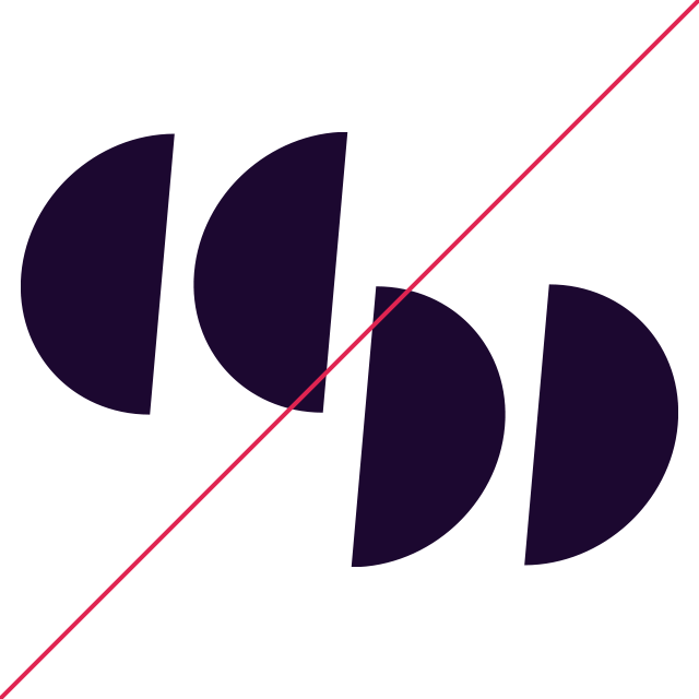
Never alter the logos, rearrange them or remove elements from them.

Don’t change the brand colours and be respectful of the background it is on.

Don’t skew, squash or rotate the logos.

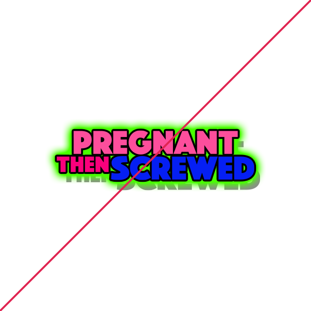
Don’t stylise the logo using treatment such as borders, shadows and glow effects.

Respect the clearspace guidelines. Let the logos breathe.

Never use poor quality versions of the logo. These shouldn’t exist as all variations are available in vector format.